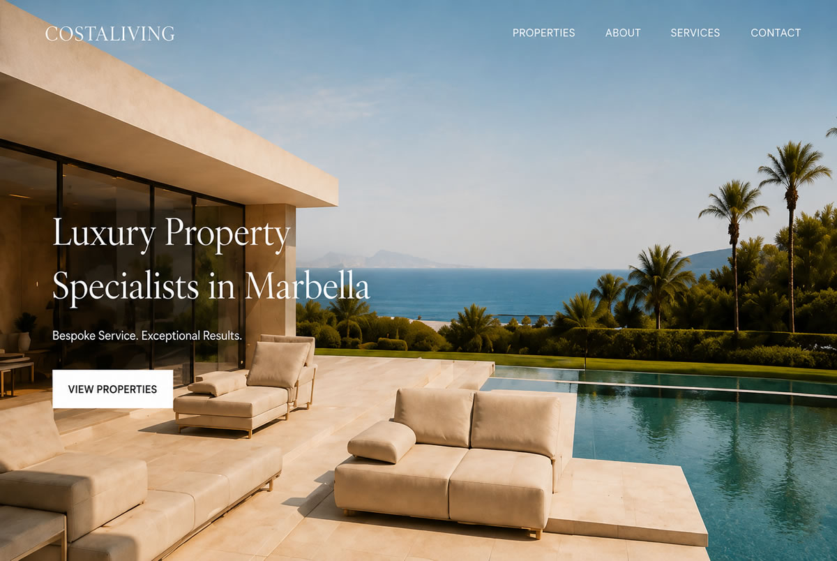
Responsive Website Design
Mobile-Friendly Websites That Work Properly on Every Screen
I design and build responsive websites that look professional, load clearly and are easy to use across mobile, tablet, laptop and desktop screens.
Mobile First Impressions
Your Website Needs to Work Wherever People Find You
A website may look fine on a large screen, but that does not mean it works well on a phone. If visitors have to zoom in, struggle with the menu, wait too long for pages to load or cannot easily contact you, they are far more likely to leave.
Responsive website design is about removing that friction. The layout, text, images, buttons, forms and navigation all need to adapt properly, so the website feels natural on every device.
I design and build websites with this in mind from the start, not as a last-minute fix after the desktop version has been finished.
Responsive Design
More Than Just Making a Website Fit on a Phone
A good responsive website is planned carefully. It should feel simple to use, easy to read and consistent across different screen sizes.
Navigation
Readable Text
CTA Buttons
Flexible Images
Performance
Common Problems
Is Your Current Website Difficult to Use on Mobile?
Many older websites were built before mobile browsing became the main way people use the web. Others may technically resize, but still feel awkward, cramped or difficult to use.
If your website is frustrating on a phone, it can damage trust before a visitor has even spoken to you. A mobile user should be able to understand what you offer, browse key pages and contact your business without effort.
- Tiny text that is hard to read
- Menus that are awkward to use
- Buttons that are too small to tap
- Images that crop badly or overflow
- Contact forms that feel difficult on mobile
- Pages that load slowly
- Content that appears in the wrong order
- Layouts that feel cramped or broken
Why It Matters
A Better Mobile Experience Can Help You Win More Enquiries
Responsive design is not only about appearance. It affects how confident people feel using your website and how easy it is for them to take the next step.
Service Businesses
Visitors need to understand your services, check if you are the right fit and contact you quickly.
Ecommerce Websites
Customers need to browse products, read details and complete orders without frustration.
Property & Hospitality
Mobile visitors often want to view images, check details, compare options and make contact.
Local Search Visitors
People finding you from Google often arrive on mobile, so the first experience needs to be clear and useful.
Across Every Screen
Designed for Mobile, Tablet, Laptop and Desktop
Your website should feel consistent, but the layout should adapt to suit the screen it is being viewed on.

 Desktop

 Laptop

 Tablet

 Mobile
The Approach
Responsive Design Planned From the Start
When you work with me, responsive design is part of the project from the beginning.
I think about how each section will behave across different devices while the website is being planned, designed and developed.
The Advantages
Working directly with a freelance website designer and developer helps keep the project clear and consistent. The design does not get handed from one team to another — I stay involved throughout the process, so the visual design, responsive layout and technical build all work together as one.
- One person handling design and development
- Responsive structure considered from day one
- Clear communication throughout the project
- Testing across common screen sizes
- Support available after launch
- Honest advice if an existing site needs improving
Responsive Foundations
What Every Responsive Website Needs
Responsive Structure
The layout is planned so content adapts cleanly across phones, tablets, laptops and desktop screens.
Performance
Images, code and page structure are considered carefully to help the website load efficiently.
SEO Foundations
Mobile usability, clean structure and clear content all help create a stronger base for search visibility.
Need Help
Already Have a Website That Does Not Work Well on Mobile?
Get in Touch
I can review your current site and give you straightforward advice on whether it can be improved or whether a responsive redesign would be the better long-term option.
Sometimes a few focused improvements can make a real difference. In other cases, rebuilding with a cleaner, mobile-friendly structure gives your website a stronger foundation for the future.
Responsive Website FAQ
Frequently Asked Questions
Do all websites need to be responsive?
Yes. A modern website should work properly across mobile, tablet, laptop and desktop screens. Visitors expect a website to be easy to use wherever they view it.
Can you make my existing website responsive?
Sometimes. It depends how the website has been built. I can review the site and advise whether it can be improved or whether a redesign would be the better option.
Will a responsive website help with SEO?
Responsive design can support SEO because mobile usability, page speed, structure and user experience all matter. It is not the only SEO factor, but it is an important foundation.
Will my website look the same on every device?
Not exactly. A good responsive website adapts to the screen it is being viewed on. The design should feel consistent, but the layout may change to make the content easier to use.
Do you test websites on mobile?
Yes. I check layouts, navigation, forms, buttons, images and content across common screen sizes to make sure the website works properly.
Is responsive design included in your website design service?
Yes. Responsive design is included as standard in the websites I design and build.